Objective
By using P-Splines (Penalized Smoothing Splines) to draw a smooth line on two dimensional scatter plot on R.
Code Examples
Sample code from Package ‘pspline’
data(cars)
attach(cars)
plot(speed, dist, main = "data(cars) & smoothing splines")  # scatter plot the original data
lines(sm.spline(speed, dist, df=10), lty=1, col = "red", )  # draw the P-Spline curve with degree of freedom 10
lines(sm.spline(speed, dist, df=100), lty=1, col = "green")  # draw the P-Spline curve with degree fo freedom 100
legend("topleft", legend = c('df=10', 'df=100'), col = c("red", "green"),  lty=c(1, 1))
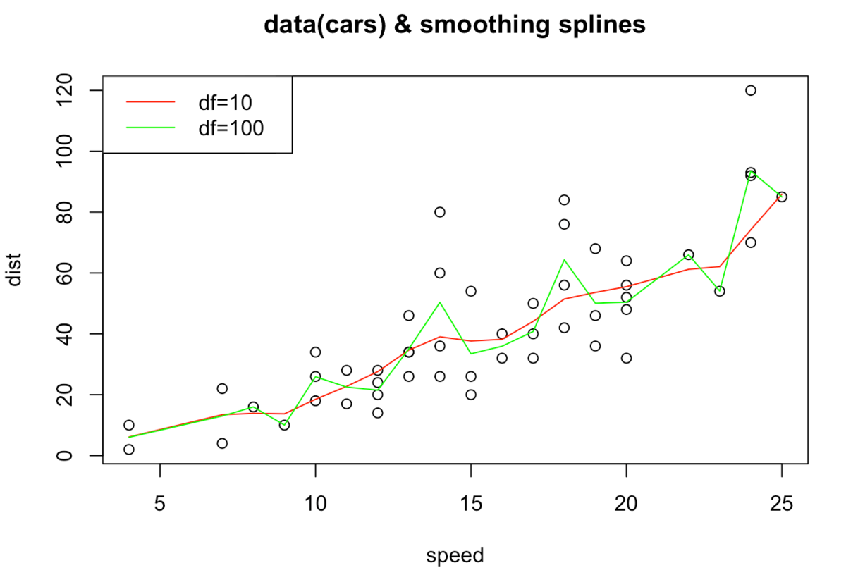
We confirm that the larger df (=degree of freedom) leads to more zigzagged line (bias-variance tradeoff).
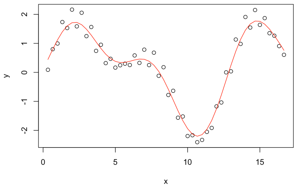
Artificial Data
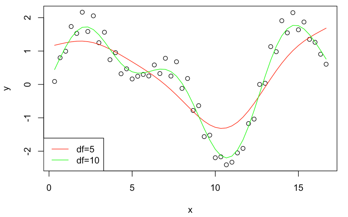
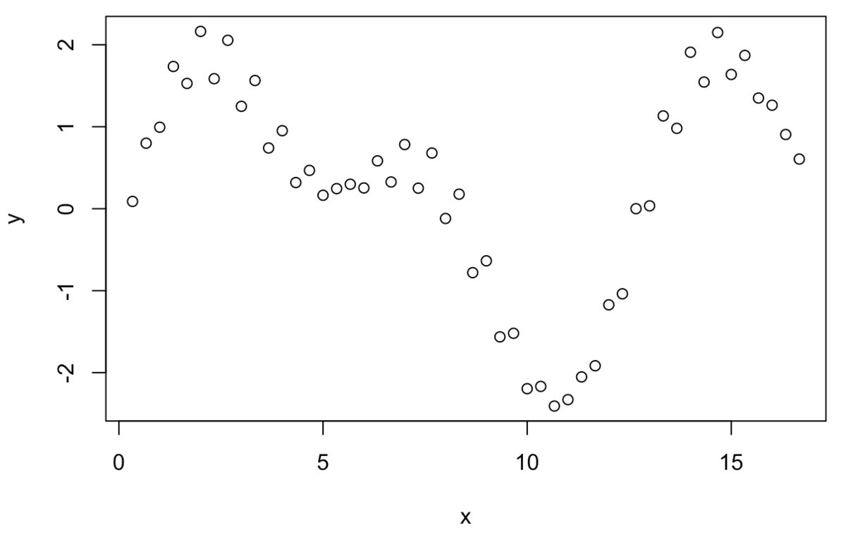
x = (1:50)/3
y = sin(x) - cos(x/2 - 5)*1.5 + 0.3*sin(x*10)
plot(x, y)
lines(sm.spline(x, y, df=5), lty=1, col = "red")
lines(sm.spline(x, y, df=10), lty=1, col = "green")
legend("bottomleft", legend = c('df=5', 'df=10'), col = c("red", "green"),  lty=c(1, 1))
Application on Real Data
For example, we can apply P-Spline on stock transaction data to extract intraday seasonality
X-axis: time stamps transaction occurred.
Y-axis: trade interval from the last trade
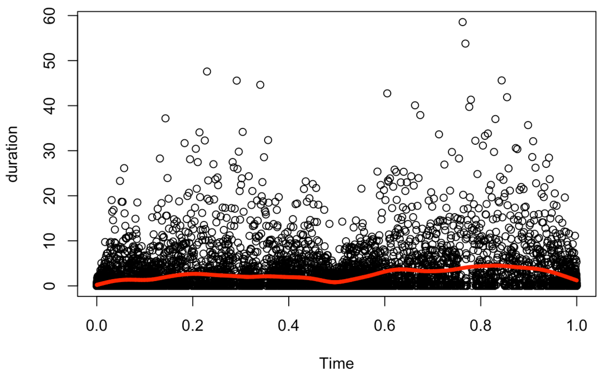
We can confirm the intraday seasonality with P-Spline (shorter transaction interval right after market opens, and right before market closes.)
Mathematical Background
Now, consider
Here, \(x\left(t _ j \right)\) is the spline’s prediction, \(y _ j\) are the actual observed points.
Now, how we decide \(x\left(t _ j \right)\) ?
The first method comes to our mind is probably least square method.
P-Spline utilizes this idea of least square method.
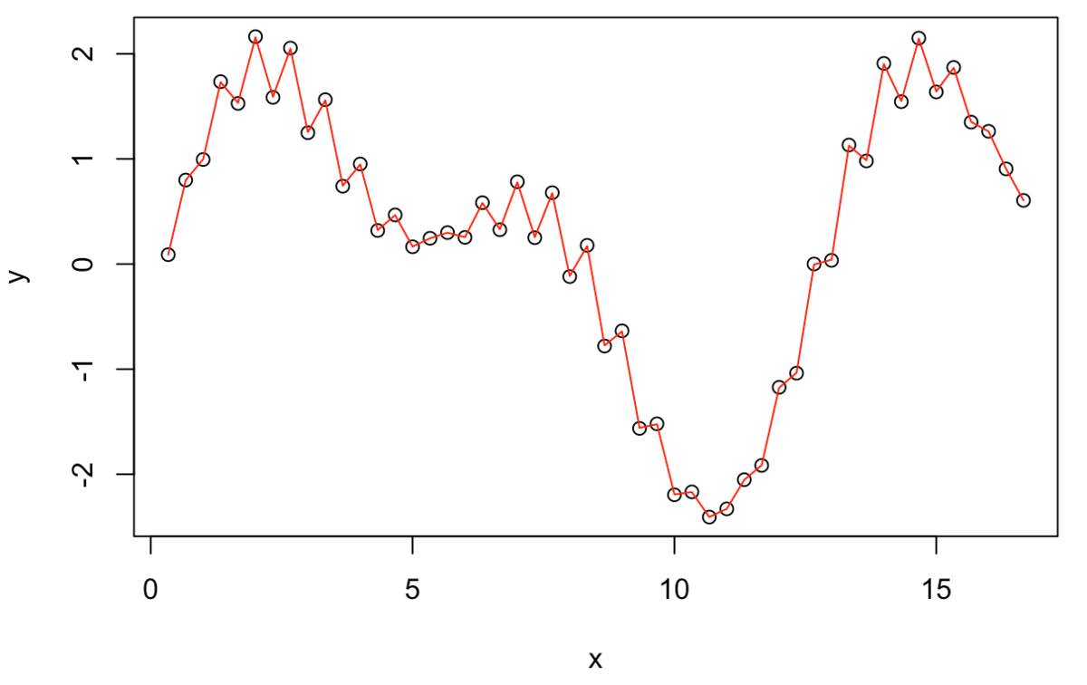
Now, we consider what kind of line we want to draw.
If we have these ↑ points, the line we want to draw would look like this↓
We can also draw a line like this:
 But this↑ is not what we wanted. We penalize this zigzag in the P-Spline.
We define penalty as: